
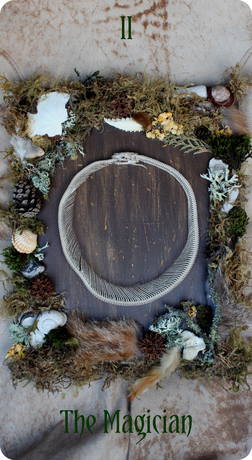
Happy Friday, all! So here’s a quick mock-up of the Magician card I did this afternoon, practicing photography and graphics skills. (I still have a year before I have to have final files, so plenty of time to brush up.) No color correction and only a little bright/contrast tweaking.
My plan is for the cards to not have borders, and for the text to be very simple so as to not detract from the images themselves. Keep in mind that I’m working with GIMP 2.0, which while it does a lot of the things Photoshop does, has its limitations (particularly with regards to text effects). Like I could pretty easily add a drop shadow to the text here, but anything fancier may or may not work. Also keep in mind that my photography and graphics skills are still fairly rudimentary, and this project is going to be an excuse to get better.
So what are your thoughts? I’m open to your constructive feedback! And thank you
As always, I love your assemblage pieces. I like the background (reminds me a little of birch bark!), and how it doesn’t have a border. I agree with allowing the piece to speak for itself and not detract from it. The only thing I can think of is perhaps flipping the location of the numbers and name of the card or maybe a deeper green for the name of the card? Just an idea and definitely not a “hey you should do it this way” thing. Thank you for sharing your work in progress- I always get excited to see a new post. Brightest Blessings! )O( Sam
Thank you! The background is actually an antelope leather coat I got secondhand. And thanks for your design feedback; I’ll keep it in mind when I make the final design.
Personally I would see if you can add a glow outside the letters, much lighter so that it is oulined on the areas that are dark, and the dark inner shows on the lighter areas. Drop shadows can look good, I’d play with it and just see.
Also I have a paid copy of PS 5 if you want it. I never use it, I tend to keep with PS 2
Thanks for the feedback! I probably am going to give the letters a border. I don’t think drop shadows will work well print-wise, especially on something this small; I might go with a more solid border instead.
And thank you for the offer; I’m not sure if I have time to learn PS from scratch in addition to everything else, but I’ll keep you in mind.